
(Branding)
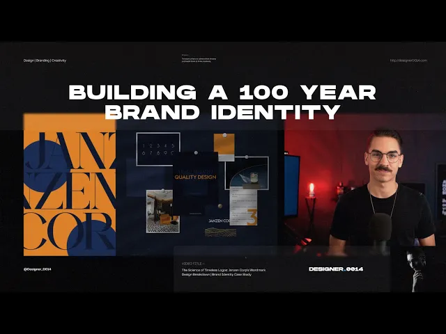
In this blog post, I delve into the intricate process of crafting a timeless wordmark for Janzen Corp, a family business with ambitious goals and a unique aesthetic.
Published:
001
Designing for a Brand Meant to Outlive the Present
Today, we're diving deep into a recent project that's got me thinking about the very concept of time: how can you design a wordmark for a brand that plans to stand the test of centuries?
Strap in as we delve into the intricate journey of creating a wordmark for Janzen Corp, a company harboring ambitions of generational impact.
Understanding the Brand’s DNA
When embarking on the odyssey of brand creation, the first anchoring point is, naturally, the brand itself. What principles underpin its vision?
For Janzen Corp, a family enterprise rooted in Dutch heritage, the scope was grand: design an identity that could last hundreds of years. This was quite a unique task, given the ephemeral nature of companies and the even quicker evolution of brands.
After intense rounds of discovery sessions and dialogues with the company's founder and president, Mark Janzen, the brand's stylistic compass was set: Art Deco, with a dash of modernity, sprinkled with the colors of commerce and Dutch royalty.
Setting the Visual Landscape
Before even laying down the first pixel of the logo, a robust stylescape was essential. The stage had to be set for the forthcoming hero: the wordmark.
A navy-blue color palette marked the corporate tone, and bursts of orange signaled the Dutch lineage. The entire brand ecosystem was to exude premium, high-end Art Deco style. And here, the typeface Geograph by Klim Type Foundry played a quintessential role.


002
The Architecture of Timelessness
Why Capital Letters Matter
When you're crafting a wordmark that's expected to live for centuries, the margin for error is almost nonexistent.
In the vast ocean of Art Deco typefaces, the challenge was to strike a balance between style and longevity. Too stylized, and it may lose its relevance. Too generic, and it loses its soul.
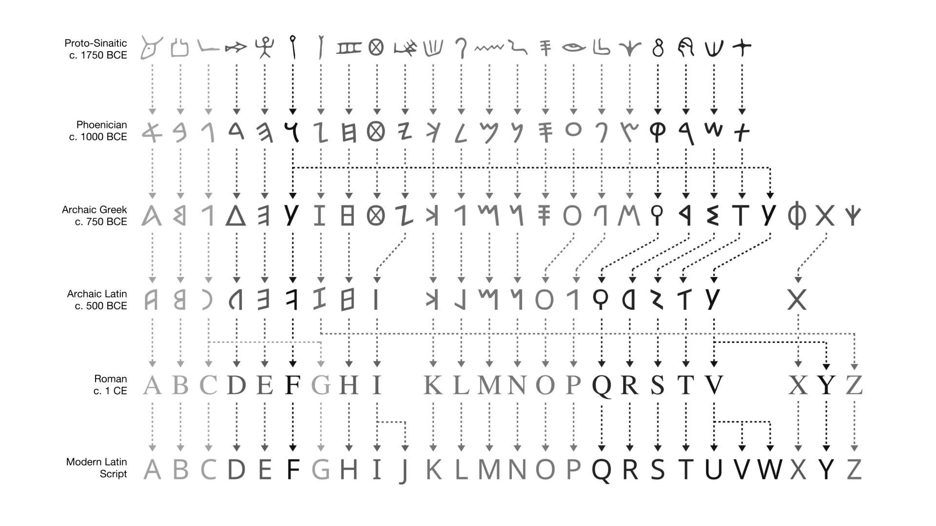
Observing the oldest wordmarks in existence provided a vital clue: capitalize.
Uppercase letters not only survived the tide of time but also offered foundational stability. This of course isn't difficult to understand if one simply looks at the evolution of our modern alphabet.
Our modern English alphabet is derived from capital letters, with lowercase letters being a far more recent addition. For this reason, there is significantly less change in geometry among capital letters.
003
A Symphony of Shapes
Treating Language as Geometry
Recognizing that language could evolve into unrecognizable forms centuries from now, I looked at the alphabet not just as a set of characters but as a collection of geometric shapes.
Could these geometric forms be versatile yet distinctive enough to last?
This train of thought steered the design process toward the geometric forms of certain letters: A, N, and Z as triangular, and C, O, P, and R as circular.
Finding the Creative Focal Points
While legibility and heritage were paramount to this design's success, breaking down the characters in this way brought three particular characters into review as potential focal points of creativity.
I knew some aspects of this wordmark needed to feature unique characteristics that could be distinctive and recognizable. The characters E, P, and R provided that creative opportunity, while maintaining a more traditional style with the other characters.
Imagining an age where triangles and circles may outlast alphabets, these three letters offered the canvas for timeless ingenuity. I was able to focus my efforts on creating unique geometric forms that both established an identity and told a story.

004
A Foundation for the Next Century
The Final Wordmark
The resulting wordmark amalgamates the brand's heritage, ambitions, and stylistic choices into a unique but geometrically grounded design.
The E, P, and R of Janzen Corp don't merely fill spaces. They tell stories.
While the rest of the characters reflect Janzen Corp's commitment to simplicity and timelessness, the three creative characters express lineage, and they challenge the ravages of time.
The wordmark strongly communicates its heritage while looking forward toward the future.
Versatility, Uniqueness, and What Comes Next
This wordmark is a harmonious marriage of form and function. It's poised to be a versatile flag bearer, one that could represent the brand in diverse industries.
While its simplicity shines through, its unique geometry remains distinct enough to stand out and be remembered. And isn't that the very essence of branding: to be unforgettable?
The goal was clear from the beginning: to lay the foundation of a brand identity that could be continually built upon, evolved, and maintained for centuries.
With the geometric core of this wordmark, I'm confident that future designers looking back would find a solid base from which to draft their interpretations. My focus on combining angular and spherical forms should empower future designers to create recognizable derivative work, even if their alphabet is unrecognizable to ours in the year 02023.
So there it is: the story of how Janzen Corp's wordmark came to be.
I hope you enjoyed my documentation of one of the most intriguing challenges of my branding career and the process behind how I answered the question: “How would you approach a design project that seeks to defy time?”